digital scrapbooking

time for a creative update…

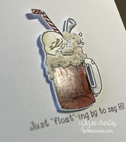
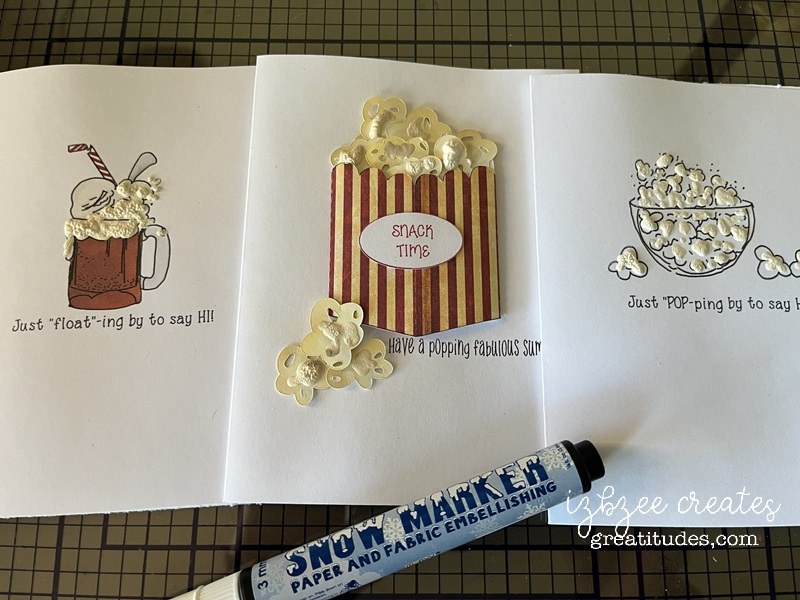
Rootbeer floats for a July hello card. These were lots of fun and using some heat and puff stuff really helped with the details on the float. Mod-Podge applied to the glass, straw and spoon.

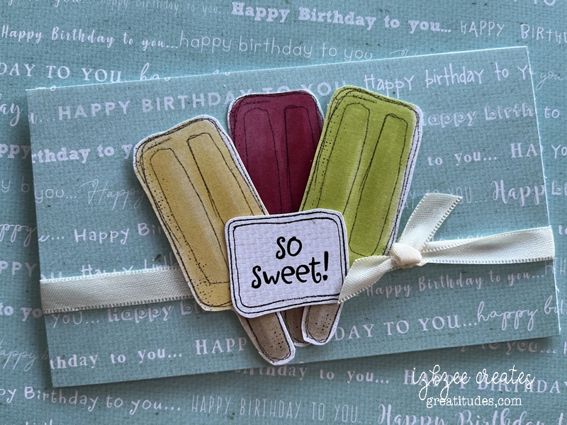
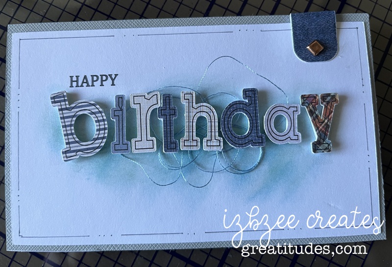
A quick birthday card – images and paper from Lasting Impressions.

a little more fun!

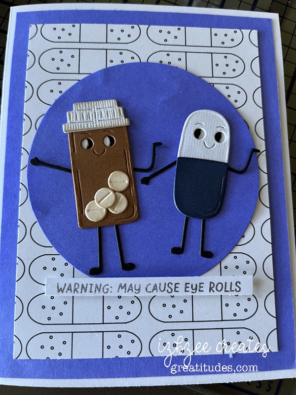
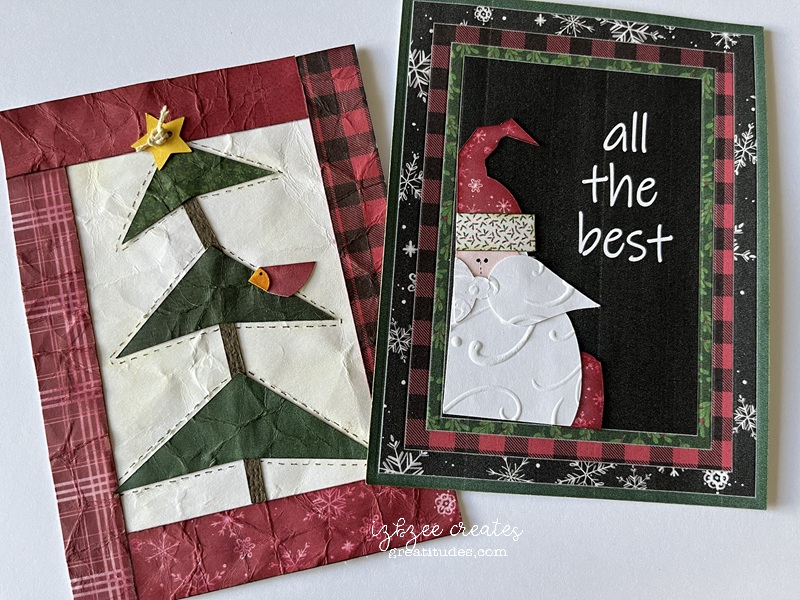
Background paper, my own design. Dies from Spellbinders.

fun card size paper quilts. Digital papers from Nit Wit collections and Carta Bella. And old swirl texture plate from Sizzix for the embossing.

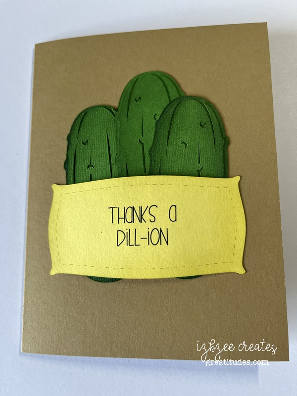
A thank you card — pickles for pickles! Pickle SVG download from Witchvector. Lots of inking!

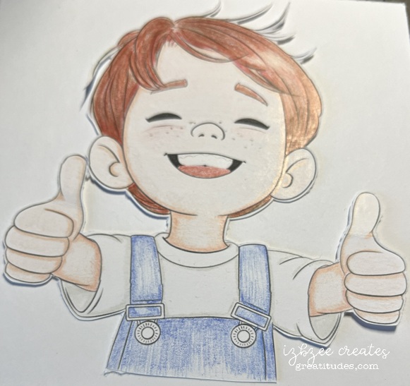
one of four images from Sweet November Stamps colored with Rembrandt pencils on smooth 110 lb Neenah stock.

I think I’ll stop for now. I have a few more things to share — but they can wait until next my next post.

Have a creative week!

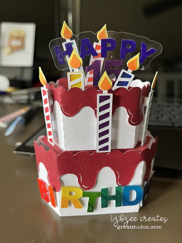
birthday pop up

This pop up was a fun make — proved challenging at times, but overall, worked out as planned. Based on a Pinterest inspo and made using a go-to file from Simply Crafty SVGs. You can find the Valentine Gnome box card file on Creative Fabrica.

I changed the wrap around piece to a straight across piece and added a half circle edging across the top in SCAL 6. Once that piece was finalized, I copied that piece and then cut the bottom third off and added some small ovals using back minus front and union. Then made a few adjustments using the node tool to finish the icing for the cake. Remove the scoring lines from the icing piece. You won’t need them or the tab on the end. You can use the knife tool to remove it or leave it and use some scissors after cutting to take it.

The inside part of the box weren’t altered. No inserts were used on the bottom tier — and the cutouts don’t alter the support as the base and can’t be seen when the 2nd tier is glued in place.

The inserts were adapted by cutting off the pieces that would have supported the elements used in the original design. You can glue the candles to the tabs and the transparency has a long enough insert that it can be secured with some double sided tape and you don’t need to cut that tab/insert unless you want to.

A blocky font was selected for the HAPPY and BIRTHDAY. He turns 15 this year and so we added that as well. All lettering and the candles were cut in white and then colored with markers. A bit of Mod Podge was brushed across the top of each letter and number for a little more gloss.

Just a note: A previous test of the design was done in cardstock. The red cardstock was just a little too heavy and didn’t adapt to the folding/training as well as I’d hoped. However, after another 24 hours of training, it’s holding much better, but being the impatient sole I am, I did a print and cut version in a slightly lighter weight and had better luck there almost immediately. The version shown above is the print and cut version.

The base tier is cut at 100% and the second tier is cut at 85%. Both tiers can be cut using a single 8.5 x 11 sheet if you’re doing a single color base — white on white or pink on pink, etc. The candles and lettering/numbers can be cut on a single sheet as well. Alcohol markers were used for colors and some inking along the edges of the inserts, icing and inside box were also done to add a little more depth to the cakes.

Assemble using the video as a guide. Do not put the wrap or icing on the botton tier until you’ve glued the 2nd tier to the base. While the bottom tier is standing, apply glue to the base of the second tier also open and standing. Center on the top of the base and once the glue has had a few seconds to grab hold, fold the base to flatten. Place a weight on top and allow the glue to dry. You may need to retrain the pop up a bit, but it should open and shut as designed. Now add the wrap and the icing and any additional elements that you have chosen to add to your design to the base.

If you use pop up dots, you’ll need a boxy envelope. This is added postage if you send it through the mail system. But we’re offering hand delivery on this one. 🙂

Have an awesome day — hoping it’s a crafty and creative one for you.

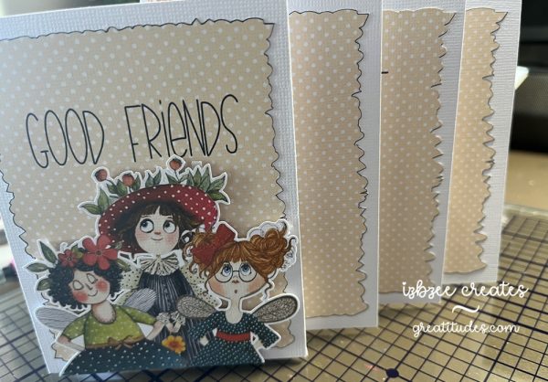
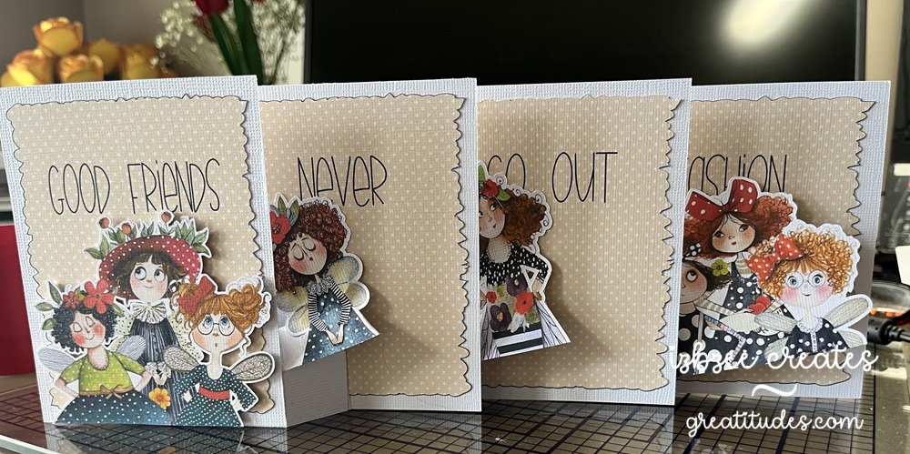
4 layer pull-out card

I first saw an example of this card on Pinterest – traced it down to the designer and yep, made a cut file using her free template/measurements found on her YouTube channel. Here’s the link: https://www.youtube.com/watch?v=Wsj4VVUHoDI

The fairy images are from Etsy and the panel image is from Creative Fabrica (one of their many polka dot collections). The opacity is at 33% with a bold dark blue outline which I did want to show a bit when cut. The Deckle edge rectangle is an oldie from Penny Duncan Crafts (2011). The font for the sentiment (Good Friends Never Go Out of Fashion) is Fairy Sketch. No inking on this version of the card.

So fun – It is a little oversized and thick so extra postage on this one.

Have a creative week! Enjoy your time in your studio, browsing for ideas or just musing at your art! And of course, SMILE!

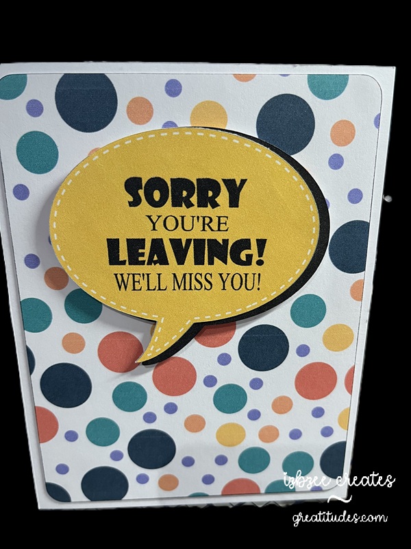
We’ll miss you card

This was a Pinterest inspiration. There are days that something just fits the bill and doesn’t take all day to create. This was one of those quick and easy projects…..

Talk bubble shape is from the SCAL library. Created an inset shadow and changed the outline to dashed. Added another shadow at .075 to go behind the talk bubble. I decided that I would add this as an additional element rather than just having a single layer print and cut… though I think that would work nicely as well. The background paper for the rounded large rectangle was from Creative Fabrica – though I’m not sure it’s still available as I purchased the collection several years ago. The fun font is from Adobe. It’s fun to use more than one font and size for this sentiment.

The bubbles and rectangle are filled with color and pattern and then sent to the printer. Cut using the SCAL 6 software with the Skycut C24 plotter. I really do like my cutter. Print to cut is generally spot on and I don’t have to add a bleed to the shape so ensure an accurate cut.

Hoping you’ll have some time to spend in your creative space soon! Have a great day!


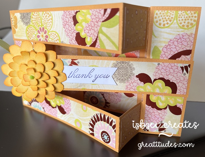
Triple Bridge card

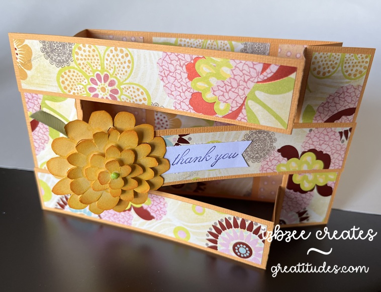
This was a fun card to make — easier than I had originally thought and the inspiration came from a reel as I was scrolling a couple of weeks ago…. yep, I’m finding a few fun ideas here and there during some mindless time on my phone.

The sentiment (thank you) and the flower are from Stampin’ Up! sets long ago retired. *The flower was cut multiple times and then each “layer” was cut separately and inked for a little more volume and interest. The patterned paper is from a very old K&Co stack I purchased while we lived in another state — so it’s likely more than 11 years old.

A fun fact is that the base of the card can be cut from a single 8.5 x 11 inch sheet of cardstock. The panels almost fit on a 6 x 12 inch piece of double sided paper. And probably could if a few of the pieces were moved closer together or were cut by hand.

I enjoyed taking the template measurements and turning this into a SCUT file in SCAL 6 and using my Skycut to cut and save some time in the future when making this card and using digital paper for the panels when certain patterns require some finessing for printing. Only the base and panels were used in the SCUT file.

*The stamp images were not digitized.

You’ll need:

8.5 x 11 inch cardstock in your base color
12 x 12 double sided patterned paper

Scraps for flower and sentiment
Ink pad and blender tool
Glue or dry adhesive (I used Bearly Art Precision Craft glue for this sample, however, I think I’ll use some double sided tape for future makes)
SCAL 6
Skycut C24
Cutting and Scoring Template was found here. I altered the assembly slightly to put my own twist on the idea presented. However all measurements remained the same.

Floral stamp or other stamp for a focal piece
Sentiment stamp


Hoping you’re enjoying an awesome Spring day wherever you are and have inked in some creative time this week or for the upcoming weekend. Enjoy your time and keep nurturing your creative spirit.

3 Spring Tags – Reveal Day 2

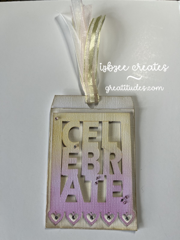
Day 2’s tag started out as white paper. I love the ombre look and while it really isn’t shabby chic, it was still fun to create. This is a pinterest inspired project. I know there’s a die that does something similar, however, this one is my design using elements from the SCAL software and the Impact font.

It was fun to play with the font — using several commands and then join to a frame created using a rectangle and an inset shadow layer and another command found in the software. Adding the heart border was quite easy and adds just enough detail that I really like how it makes the boxy framed word a little softer. All layers are inked, the top layer uses two colors blended softly and then the lower two layers are inked to add a little more interest around the edges.

A few gems were added for some added texture (you can’t really see it in the pic) and sparkle.

Ribbons are from my stash.

3 Spring Tags – it’s a reveal!

For the last 5 or so years, one of the Facebook groups I belong to has been celebrating the arrival of Spring with a Spring Tag Reveal. This year is no exception — in years past, we’ve done anywhere from 3 to 5 tags… this year, we’re doing 3.

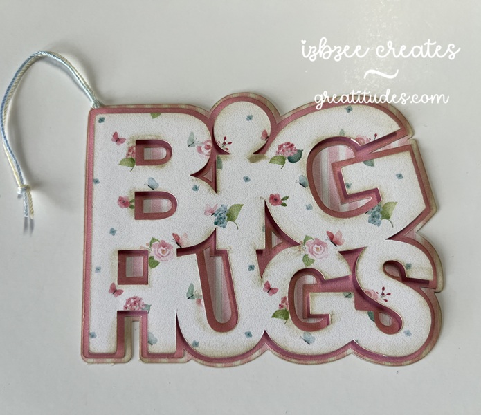
It’s looking like Shabby Chic will be my theme for this season’s tags. I used a couple of digital collections in my stash and some inspiration from Pinterest. I did purchase a file for today’s tag from Etsy and resized 2 of the pieces to form my tag.

DAY1: Layered looks are always fun! Digital paper selections are from the Porch Swing Fat Quarter Collection from Nit Wit Collections provided the patterns for this layered tag. The edges of each layer is inked with Oatmeal Cookie from FSJ (retired) and some foam tape was used to pop the top layer of the tag up. Bearly Art glue was used to adhere the bottom two layers of this tag together. Cotton crochet thread was used for the hanger.


Looking forward to sharing the next two tags over the next two days. Hoping you’re carving out some creative time on a regular basis. Have some fun!

I did a thing….

I saw the spinning cube design on Instagram – no svg for it, just some measurements and a short video to do the construction (@gayatriscrafts) and I made one. This is my test version to see if I could get that cube to spin! AND…. I did it! I’m really happy that it worked and I think I can tweak the svg file I created a bit more to make this thing a little sturdier (and use a smaller stack of magnets or a stronger one).

This is a show stopper in that the cube is connected to the base by a bit of clear thread (nylon – like fishing line), but not to the arm. The magnets in the arm and cube have enough strength to keep the cube suspended and allow it to spin. I think the grandkids will like this one a lot!

*I did create an SVG file to cut this one using SCAL — it’s for my personal use only and will not be shared or sold.

I do need to make a few tweaks to my file before I cut another however as the end of the arm needs a little more finishing. I used foam core instead of cardboard as fill for the post and arm. It is sturdy, but the post needs another brace to keep it from leaning towards the cube – if you’re a bit of a perfectionist or have a bit of OCD. We were able to get the cube to spin and stay in place overnight without falling – but the post was leaning in a few degrees toward the cube more than it was when we started our “experiment” with the cube just hanging there.

It’s a fun project and I look forward to making another soon.

where’s the cuckoo?

It’s been a crazy couple of weeks around our place… thus the cuckoo title. Me thinks the cuckoo flew the coop! Oh well, on with the make. I’ve gotten out of the habit of late taking pictures of the progress, so we’ll just have a couple.

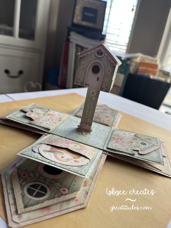
I did add a sound module from Invite By Voice to this make from Emma Parrish – you can find her shop on Etsy — and it’s really kind of fun to listen to when you open the box and look through the flaps and pockets. I didn’t follow her design exactly, but pretty closely. The audio was a find on Pixabay… yep, they have audio files and video files too!

TIP: You do need to pre-print the backs of each sheet before cutting. I did have to do a little redraw on a few shapes for a clean cut in SCAL — the jpgs just didn’t trace well – and that is a drawback to SCAL on some things especially if there are light lines on the image. I chose not to do the preprint on the back, but did print a separate sheet and cut the shapes. It worked well and gave my box a little more stability in the base and on the side walls.

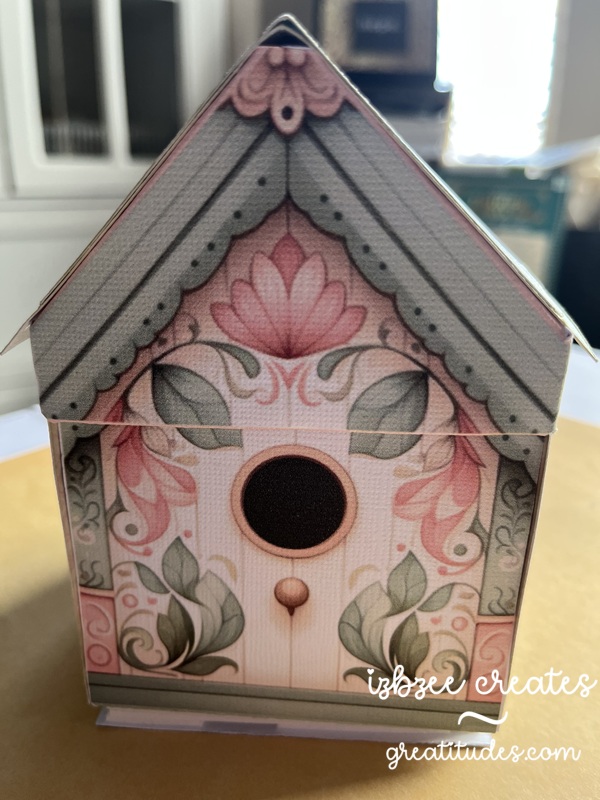
That birdhouse in the center of the base does stand on it’s own. I changed out the flowers in the kit and used a flower punch. You do need at least 2 layers on the flower for extra strength at the base of the post. While you can’t see it in the picture, there is a Nuvo drop center in the flower for a little extra detail. Each of the images in the pockets are provided in the kit. And there were a few extras left over.

Even on selecting BEST for printing, the colors are a bit muted and vintage looking. I like that. The design is well thought out. She has lots of printable designs in her shop.

I wonder if the cuckoo will find it’s way home again?

where’s the cuckoo?

Additional materials:
AC and Encore cardstock (textured white)
Printer
Bearly Art glue – fine tip applicator
bone folder
foam tape
Sound module (light activated) from Invite By Voice
mp3 audio file (freebie from Pixabay)
Distress Ink (Old Paper)
blending tool

Hoping you’ve got some creative time inked in on your agenda for the coming week. Have some fun and nurture your heart along the way.

they fold flat for mailing!

These Pinterest inspired cards were so fun to make and the last projects for January 2026 that I can publish at the moment! 🙂 Just waiting for a few more things to get to their recipients.

The base for this hexagon shaped box card is adapted from the Valentine Gnome Box Card from Simply Crafty SVGs. I trimmed off the top edge of the base and the extensions on the insert risers. Easy to accomplish in the SCAL software using the knife. Close the path once you’ve completed the slice and removed the unwanted piece. Make sure you re-group any pieces with score lines.

The “realistic” chip and avocado images are a find on freepik.com. They come with a white background – if you want a transparent background you can opt for the premium version and pay for a subscription to the site. HOWEVER, you can eliminate the white using the Paint app in Windows. Choose layers, hide the white. A white background will still show. Then choose the icon for removing the background. The white should disappear, leaving a transparent background behind the chip. I used the eraser and removed the shadow under the chip for a cleaner image. Save As a png and then you can import the file into SCAL. The cut is pretty clean. No TRACE needed since your image is a png. There are lots of other software/app options as well that will remove the background from the image. The above is what I used for this project. The edges of the cut chip images were inked with some yellow orange ink for some added “powdered cheese.” The process is basically the same for the avocado if you choose to add it.

The labels are found in the SCAL library. No shadow layer was added. The fonts used are from the fonts folder on Windows — and were set to print only in the SCAL software after they were sized and centered in the label.

AC Cardstock, Bazzil, Sabor and an old two tone green (source unknown) sheets were used to create the box and inserts. I did use the Tiny Bubbles embossing folder (Provo Craft – retired) to add some texture to the Holy Guacamole box panels. Added a little ink to add some additional interest.

Other materials:
bone folder
Bearly Art Precision glue
printer
Skycut C24
SCAL 6 Pro

The card when folded flat will fit into an A2 invitation envelope.

Hoping you have some creative time carved out in the coming week! Enjoy every moment! Nurture your creative spirit and heart as well.